Quick links
After we took a look at the true costs of email marketing in our last blog, are you looking to give your email campaigns a significant boost?
Email infographics are an incredibly powerful tool for capturing attention, conveying complex data, and generally jazzing up your marketing messages. But they’re not always used to their fullest potential. Let’s change that, shall we?
The Role of Infographics in Email Campaigns
First things first — why are infographics so powerful in digital marketing? Well, it all comes down to one simple fact: our brain loves pictures.
Then there’s our reading behavior.
Eye tracking studies show that people scan rather than read when online. And it’s chaotic scanning too:
- skipping over information
- jumping back and forth
- reading image captions but not the entire text itself.

A rough depiction of “bouncing” gazes between different SERP element. Individual examples can include more or less bouncing in any direction. Source: Nielsen Norman Group
Alternating images and text helps you keep the reader’s attention — and an infographic is better than just a plain old photo for that.
Since infographics have both pictures and words, they represent the best of both worlds: the ability to dissect a complex subject, and the ability to sustain the reader’s attention while doing so.
Source: Piktochart
Email fatigue is very real.
The average person receives 121 emails per day — a mix of personal emails, work, spam, social, and promotional emails. If your campaign happens to be one of those emails, how much of a chance do you think you’ll have to catch somebody’s attention?
Using infographics in your email campaigns could make you stand out among the competition.
In fact, when Vero analyzed the data from over 5,000 email marketing campaigns, they found that email campaigns with images had a 42% higher click-through rate than campaigns without images.
6 Best Practices for Creating Effective Infographics
You can spruce up your campaigns by incorporating captivating newsletter infographics that make complex data easily understandable and visually appealing.
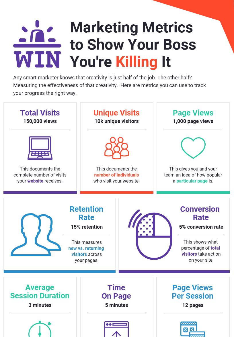
Example of visually appealing infographic. Source: Venngage
Now, let’s delve into the essential details and best practices.
1. Identifying Your Audience Segments
Market segmentation can help you to improve the performance of your marketing campaigns by helping you to target the right people with the right messaging at the right time.
Source: Lotame
Segmentation allows you to divide your audience based on various factors, including:
- customer behavior
- preferences
- lifestyle
- others
For example, let’s say you run a tech company and decide to create segments for early adopters who are always excited about the latest innovations, cautious consumers who tend to choose tried-and-tested products, and budget-conscious buyers looking for the best value.
Each of these groups would be interested in different types of information and would be attracted by different styles of infographic presentation.
To identify these segments, you’ll need to leverage your customer data.

Source: Campaign Monitor
Depending on the type of company you run and who your customers are, you could:
- look at purchasing history and the amount spent on previous purchases
- use surveys or market research
- check out email engagement stats
- consider where your audience is in the sales funnel (for example, brand-new subscribers might benefit from more generalized emails introducing them to the brand)
- learn about personal interests by creating user profiles on your website
2. Tailoring Email Infographics to Your Segments
Once you have identified your audience segments, you can start creating an email infographic that speaks to their specific interests, challenges, and needs.
This could mean:
- focusing on different products or services
- emphasizing different features or benefits
- using different visual styles and types of data visualization
For example, an email infographic aimed at early adopters could focus on innovative features and cutting-edge technology they might find in the products or services you sell. On the other hand, budget-conscious buyers might be more interested in email infographics that focus on cost comparisons among different products.
3. Simplicity Is Key
Your infographic is there to simplify information, not make it more complicated.
It should tell a story or illustrate a concept in a way that’s easily digestible.
The best infographics express rich, objective data in a way that’s more accessible and engaging than a dense spreadsheet or boring pie chart.
Source: Responsory
The best email infographics are entertaining while being educational, and they help present useful information in a logical way.
Let’s imagine, for example, a SaaS company that wants to explain how its new product works. A busy flowchart full of technical jargon could end up confusing their audience. Instead, they should aim for a simple, linear design with clear, straightforward language.
Tip: Consider creating animated infographics to make your emails stand out.
4. Consistent Branding
According to a report by Demand Metric, brand consistency can increase sales by 23% on average.
Consistent branding is what makes your email infographic instantly recognizable to your audience — so you should make sure any infographic you design reflects your brand’s identity, from the color palette and typography to tone of voice and style of illustration.
5. Interactive Elements
In an always-on digital world, asking people to focus on one thing for too long is almost a losing battle.
A study from Microsoft Corp. shows that the average person now has an eight-second attention span — which is one second less than the attention span of a goldfish.
But offer readers an eye-catching infographic email that requires them to click, hover or scroll, and you add a whole new level of engagement — hopefully just enough to get them to pay attention a little longer.

Source: Charted Institute of Ergonomics and Human Factors
For example, this great infographic about working from home and staying healthy during COVID just requires people to click on different points to access information.
Another one entitled “What the Internet Thinks About” allows people to click on different topics and bits of data — each one linked to another page or site where readers can get more information.
6. Mobile Optimization
Did you know that 61.9% of emails are opened on mobile devices?
This includes focusing on clarity and simplicity so the design looks fine on a small screen and also making sure your infographic is optimized and responsive on mobile.
Strategies for Incorporating Infographics into Email Campaigns
Okay, now you have your infographics designed and ready to go.
So how do you incorporate them into your emails? Here are some tactics to consider:
The Art of Positioning
Positioning an infographic isn’t merely a decorative idea, but a crucial part of your email narrative.
Users pay close attention to photos and other images that contain relevant information but ignore fluffy pictures used to ‘jazz up’ web pages.
Source: Nielsen Norman Group
Infographics, which naturally carry information, fit that description perfectly and can be positioned strategically within your layout to serve as your email’s main visual point.
Another study by Xerox found that full-color, vibrant visuals increase readers’ attention spans and recall by 82% and make an impression that is 39% more memorable.
The result?
The Charm of a Series
Building anticipation is a classic marketing tactic, and infographics can significantly contribute here.
According to Loomly, “serialized content increases conversions. Whether your site’s goal is more email subscriptions, more product trials, or more social shares, serialized fans become hooked and are more likely to convert.”

Source: Loomly
So why not go ahead and curate a series of email infographics to release over a period of time?
This can help sustain your audience’s interest and have them looking forward to your next email.
The Do’s and Don’ts of Using Infographics in Email Campaigns
Before we wrap up, let’s go over some essential do’s and don’ts for using infographics in your email campaigns.
✅Do Use Accurate Data
Every infographic starts with data. Whether you’re using numbers, quotes, or comparisons, accuracy is crucial.
If your data is inaccurate or out-of-date, your infographic can lose its credibility.
✅Do Use High-Quality Graphics
Superior graphics can greatly enhance the appeal and readability of your infographic.
High-quality images convey a sense of value and demonstrate the company’s commitment to quality.
✅Do Test Your Emails
Before hitting send, make sure to send test emails to different devices and email clients.
This will help you spot any display issues (such as an interactive element that doesn’t work on some email clients) and fix them before your email reaches your subscribers.
❌Don’t Overwhelm Your Audience
While infographics are engaging, cramming more than one into a single email can be overwhelming.
If you have lots of information to share, consider creating a series, with each infographic focusing on one topic.
❌Don’t Forget About the Text
Infographics should complement your text, not replace it.
An email with only an infographic and no explanatory text can be confusing.
Take a tech company introducing a new software update through an infographic — without text to provide context and explain the changes in detail, subscribers might not fully understand the update.
Final Thoughts
There you have it—the ins, outs, do’s, and don’ts of using email infographics in marketing.
By embracing these potent visuals, you can:
- simplify complex information
- boost engagement
- add a little sparkle to your email campaigns
Be mindful of your audience, keep your data accurate and relevant, and always strive for clarity and simplicity in your design.
Stick to these principles, and you’re well on your way to email marketing success.
And before you send those emails out, make sure your email list is:
- accurate
- up-to-date
- free from invalid or inactive email addresses.
EmailListVerify can help you clean up your list of outdated or invalid emails so you can minimize bounce rates, improve deliverability, and maximize the impact of your email infographic campaign.
Join Our Monthly Newsletter
Learn how to improve email deliverability and clean your email lists with and more.