12 Easy Email Design Hacks That Will Increase Your Conversions
To Design Is to Communicate Clearly- Milton Glaser

Have you heard the famous Steve Jobs quote about design? He uttered a classic quip in a 2003 New York Times Article. The late founder of Apple stated,
“Design is not just what it looks like and feels like. Design is how it works.”
The quote teaches an important lesson. A beautiful design is nothing without functionality. Yet, don’t take this idea too far in the other direction. Looks and feelings matter. They’re a key part of winning design.
When it comes to email marketing, you need to be confident in your design. Otherwise, you’re leaving money on the table. 74 trillion emails are sent each year. You want to deliver beautiful designs on this crucial marketing platform.
This article provides 12 easy design hacks that will turbo boost your email marketing conversions.
1) Using Perfect Dimensions
What’s the right dimension for an email? Early last decade, Microsoft Outlook was the king of email clients. Marketers all over the globe had to submit to the limitations of the platform. From these limitations, the email width rule of 600 pixels was born. It has largely prospered since then.
The width rule of 600 pixels is still alive and well today. However, marketers have been pushing the limits of the rule to see if they can add more pixels without compromising readability on any platform. According to Campaign Monitor, the limit can be safely pushed beyond 600 pixels,
“If you want your email to render well in every email client, it seems we can push the envelope on our email widths a bit further to at least 640 pixels.
In other words, a width of 600 pixels is the standard. Yet, 640 pixels will render well in every client if you want the extra pixels.
2) Use the Right Colors for Your Message.
Show Your True Colors
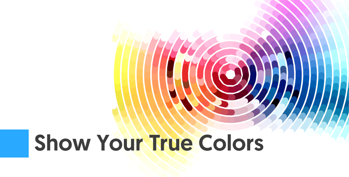
There is no one right color for all email marketing materials. Certain colors should be used with certain messages. For instance, blue represents trust and security. It’s a color often used by banks. Green represents wealth and relaxation. It’s a good color for golf resorts and gardening. Red is a color that represents urgency. It’s great to use for a clearance sale. Finally, yellow is the color of optimism and youth. Use it to grab the attention of window shoppers.
There’s more detailed information about colors here.
3) Reconsider Your Email Font
Marketers ideas about the right email fonts are archaic like the dinosaur. The default fonts for Gmail and Apple Mail aren’t the best. According to Bustle,
“Helvetica is the default setting for Apple mail; for Gmail, it’s Arial, though if your browser doesn’t support Arial, the client will switch over to Helvetica instead. The trouble is, both of these fonts, while beautiful in their neutrality, are kind of hard to read.”
Why are the default fonts suboptimal? Last decade, our screen resolution was lower, and these fonts were necessary. As technology improved, these fonts have become unremarkable. Try using Georgia, Verdana, Calibri, or Times New Roman instead. These are easier to read.
4) Run Your Emails Through the Hemingway App
The Hemingway App does a lot of awesome things. Enter your text in it, and it will highlight it in different colors. When it highlights in yellow, your sentence is too long. When it highlights in red, your sentence is way too long.
Long sentences are usually in bad taste for web writing, particularly email writing. Before you send off an email, check it in the Hemingway App. Then remove unnecessary words and divide longer sentences into shorter ones. The Hemingway App provides other useful guidelines too, such as when to remove adverbs, extra words, and more. It isn’t foolproof though. Learn when and how to disobey it.
5) Use the Rule of 10 for Bolding
You know that bolding keywords and key phrases makes them stand out. The danger is bolding too much. If you overuse bolding, it removes the effect. It can also take away from the design of your email as a whole. You can avoid this by applying the rule of 10. According to Infogineering,
“Never bold more than 10% of your total text. Avoid bolding more than 10 words in a row.”
Follow the rule of 10 for limits on bolding. Additionally, keep in mind the axiom that less is more.
6) Experiment With Larger Text
Bigger Really is Better.

How large should your text be? Size 12 is a popular standard. However, you may be alienating some of your clientele. According to Smashing Magazine,
“If you want the maximum number of people to read, understand and act on your text, then you need to set it at a minimum size of 16 pixels.”
That’s because older people often have trouble with their eyes. A 40 year old typically absorbs 50% less light than a 20 year old. Larger text accommodates more people, making a better design overall.
7) Use Alt Text
Sometimes your images won’t load. If they don’t, people won’t know what’s supposed to be there. According to Yola,
“If for any reason an image does not render on a web page, the alt tag will display in place. This means visitors to that web page understand what image should be there even though they are unable to see it.
Alt text gives a better design experience for visually impaired readers and people with email clients that don’t render certain images. Make sure to use it when possible.
8) Subheadings: The Rule of Four
Subheadings break content down into smaller chunks. It makes it easier for prospects to digest your content. According to Vertical Response, you should use subheadings for any text that’s longer that’s four sentences.
Subheadings are more likely to be read than body text. Remember that when putting together your email.
9) The Power of Bullet Points
Bullet points are a robust email feature. They allow your prospects to easily identify the most important text. Additionally, they create white space and a more alluring structure, which improves the design of your email.
Use bullet points when you have a related group or list. For instance, advantages should be in one bullet point set, and disadvantages should be in another set
10) Good Grammar and How You Can Get It.
Don’t Eat Your Words

Bad spelling and grammar will detract from your great design. You don’t want people noticing your mistakes; you want to captivate them with your design.
Your emails have spellcheck. Grammar is a different ballgame. For the most part, it’s not checked automatically. Grammarly checks your text for punctuation, grammar, and style. Alternatively, you can use PaperRater, which is a free and robust alternative.
11) Don’t Make This One Mistake When Designing Your Share Buttons
Many emails have social sharing buttons. These are a great way to encourage your tribe to share your content. Some of those buttons display counts, showing visitors how many others have shared. Other buttons don’t have a display count. As a designer, do you want to include share counts? Sites for Profit did an interesting A/B test regarding this subject,
“Where a share button has a significant count on it, there is a 10% higher time on page and 60% higher click rate compared to a button with a zero count.”
So, a higher display count means more clicks than a zero display count. That’s to be expected. The curious part of the survey is that a zero display count performs worse than a hidden display count. If you’re a new business, you may not be getting many shares. In that case, consider leaving the display count off. If your content is thriving, tout your display count. Your success has a snowball effect.
12) Don’t Put This Piece of Info on Your Prospect’s Email
Design is about showing people things they like to see. People like seeing their own name. So personalizing an email is a great design choice. Conventional marketing wisdom claims the more personalized an email is, the better it will convert. Yet, in one case, personalization will cause the reverse of your decided outcome.
People don’t like to see their last names on their emails. According to Comm100,
The one thing that Comm100 can tell you for sure is that you should never use a client or user’s last name as a personalization field. By just about every study ever done that is one step over the line of what people are comfortable seeing being used in a piece of marketing collateral.
Using a last name is a no-no. You might be including more info, yet studies show people are typically uncomfortable with it.
Great Design Will Help Your Business Grow.
Do you remember the social sharing button display count? People shared more when they saw others were sharing more. The design of the button changed how people interacted with the content. Your design influences your success. So where do you start?
Well, Steve Jobs is right. First, good design needs to work smoothly. Yet, the looks and the feelings generated are vital too. Use the twelve tips hacks above to upgrade your designs.